Navigating Tableau
Many of the pages within the Labor Market Information (LMI) website use a visualization platform called Tableau to display data and allow for interaction and customization of views by the user.
To ensure that you are able to make the most of your experience with Tableau we have included a few helpful tips and tricks on this page for your reference.
Click the button of the topic you are interested in and content will expand (+) below it providing further information. To collapse (-) the information just click the button again.
How to Print a Tableau Visualization
If you attempt to print a webpage with a Tableau visualization embedded on it, there will be a blank space on the page where the visualization should be. Below are three workarounds for this issue:
Download → PDF
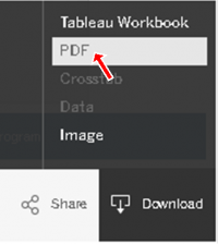
- Click the Download button, located in the bottom right corner of the visualization.
- Click PDF.
- Change settings as desired and then click Download.
- Once the window stating, "The PDF has been generated." appears, click Download again.
- Print the PDF that you downloaded.
Note: If there is a table in the visualization you’re trying to print, this PDF method will always show the top portion of the table. If you wish to show the portion of the table you scrolled down to, use either the Download → Image or Print Screen workarounds which are detailed below.
Download → Image (this will create a .png picture file of the visualization)
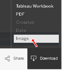
- Click the Download button in the bottom right corner of the visualization.
- Click Image.
- Once the window stating, "The image has been generated." appears, click Download.
- Print the .png file that you downloaded.
Print-Screen
- Scroll to the portion of the webpage that you would like to print.
- Hold down Alt, and press PrtScn to copy the contents of the web browser window (Command-Shift-4 on Mac OS).
- Alternative: Use the Snipping Tool in Windows, or the Grab tool in Mac OS.
- Paste (Ctrl-V in Windows, Command-V in Mac OS) the screenshot into an image editor or document software program.
- Print the screenshot using the print menu of the selected software program you pasted the image into.
How to Share Customized Versions of Tableau Visualizations
You may find the need to share a specific piece of data with a friend or colleague, or you may want to be able to refer back to it yourself! Tableau offers the ability to share a link to a customized visualization that can be used for this purpose. The link will lead to the original webpage that has a pop-up of the visualization with all of the changes that you made to it (this pop-up is still interactive). In addition, the data within the custom visualization that you created will automatically update with current data when new data is available. You won't have to recreate your visualization with each new data release.
The steps to accomplish this are as follows:
- Click the link in the bottom left of the Tableau visualization which says: View on Tableau Public. This will take you to the Tableau visualization you are currently viewing on the Tableau server.
- Now, make the geography selections and/or adjust the filters so the visualization of interest appears as you want shown when you share it.
- Click the Share button in the bottom right corner of the visualization.
- Make sure “Current View” is selected.
- Select all of the text in the “Link” box and copy it.
- Paste the link wherever you would like to share it (email, social media, etc.), or bookmark the link for later viewing.
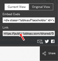
Note: Make sure that 'Current View' is selected in the menu above so that the link you share is relative to the visualization that you created.
The following is an example of a link created with this process so you can see what it looks like for the user:
Example Custom Link to the Iowa Wage Report Visualization
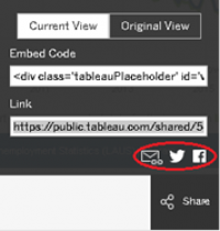
Note: You can also click the appropriate icons below the link box to directly share the customized visualization link through your default email client, Twitter, or Facebook, respectively.
How to Use Filters in a Tableau Visualization
Almost every visualization on the Labor Market Information website gives you the ability to filter the data shown to make it more relevant to you. Below are a few tips for working with these tools.
Drop-Down Menus
- Many of the visualizations contain a drop-down menu to change the Geography. By default, it is set to Statewide, but you can click it and change the selection to make the data reflect a smaller area.
- Some drop-down menus allow you to make multiple selections. For instance, within the Occupational Projections visualization you can select multiple occupational titles or groups for review. Here’s how to do this:
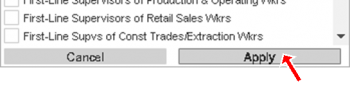
- Click the (All) checkbox to de-select every occupation.
- Click the checkboxes next to each occupation you are interested in viewing (Note: you can use the text search box below the (All) to find options more quickly, see Text Search below).
- Once you have finished making your selections, click the Apply button at the bottom of the drop-down menu (as illustrated below); the visualization will not update until this button is clicked.
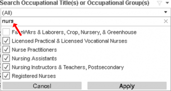
Text Search
- Text searches within Tableau match exactly on the text you enter; it will not show words that are closely related. Due to this, you may want to use shorter keywords such as “nurs” (instead of “nurse” or “nursing”) or “weld” (instead of “welder” or “welding”) so relevant results are not left out.
How to Sort a Data Table in a Tableau Visualization
It may be useful to sort a table differently than the default sort order. For instance, in the occupation table on the Occupational Projections visualization, the default sort order is by the Standard Occupational Code (SOC). It may be much more useful for your purposes to instead sort the occupations by median wage, high-to-low. This can be accomplished by following the steps below:
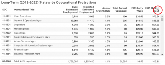
- Hover your mouse cursor over the column header so the sort icon () appears.
- Click the sort icon. The table will re-order by that column.
- If you would rather sort the selected column low-to-high, click the sort icon again.
Chart Interactions
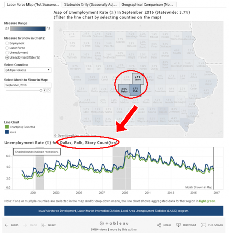
If there is more than one chart or table in a visualization, oftentimes there will be built-in interactions between them. For instance, in the LAUS visualization, selecting one or more counties on the map will cause the line chart below to update and show that area’s unemployment rate over time. Pay attention to the chart titles — these types of interactions will usually be described there.
How to Navigate Tableau Maps
Tableau maps come with several useful tools that may not be apparent to users. Below are descriptions of some of those tools that will allow you to navigate Tableau maps more easily. If you hover above any Tableau map, a toolbar will show up in the top left corner. The following icons are in the toolbar along with descriptions of what that tool does:
- Search for a geography (city, county, state, etc.) on the map. Pressing the enter key or selecting the submit button will pan you to the selected area.
- Zoom in (+) or out (-) of the current view.
- Return to the visualization's default view (and zoom level).
- Access additional zoom and selection tools (which are detailed below).
- Select a point on the map and drag to create a rectangle to zoom into that portion of the map.
- Select a point on the map and drag to create a rectangle to select all counties (or whatever geography is shown) in that portion of the map.
- Select a point on the map and drag to create a circle around that point to select all counties (or whatever geography is shown) in that portion of the map.
- Draw a free-hand region on the map to select all counties (or whatever geography is shown) in that portion of the map.
Another way to select counties on a map is to simply click on them. On Windows machines, holding down Ctrl (Command on Mac OS) and clicking lets you select multiple counties.
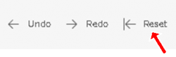
How to Undo a Change or Reset a Visualization
Tableau visualizations all have a toolbar at the bottom that functions identically across all dashboards. There are three buttons on the left side of the toolbar that can be used if you make a mistake and want to undo an action or just start over:
- Undo - Undo your last action
- Redo - If you used the Undo button, this button will Redo that action
- Reset - This will change all of the settings in the visualization back to its default, or original, view (undoing all of the changes you have made)
Note: Reloading the web page will also reset the visualization and allow you to start over.
How to Embed Customized Versions of Tableau Visualizations on Your Website
A great way to include relevant and up-to-date labor market information on your organization’s website is to embed Tableau visualizations from iowalmi.gov that you customize for your specific audience! This could range anywhere from showing the unemployment rate for your region to the occupational projections or wages. The data within the custom visualization that you created will automatically update with current data when new data is available. You won't have to recreate your visualization with each new data release.
The steps to accomplish this are as follows:
- Click the link in the bottom left of the Tableau visualization which says: View on Tableau Public. This will take you to the Tableau visualization you are currently viewing on the Tableau server.
- Now, make the geography selections and/or adjust the filters so the visualization of interest is in the state you want shown by default on your webpage.
- Click the Share button in the bottom right corner of the visualization.
- Make sure “Current View” is selected.
- Select all of the text in the “Embed Code” box and copy it.
- Paste the text into the appropriate section of your webpage’s HTML code.
- Publish your site with the updated code.
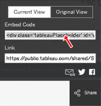
Note: Make sure that 'Current View' is selected in the menu above so that the code you embed into your website is relative to the visualization that you created.